 |
| Preliminary Sketch |

Tuesday, December 10, 2013
Tuesday, November 26, 2013
Friday, November 22, 2013
Comparison of 2 Designs
1: What are the major differences in these 2 versions?
in the first design, the text is within the record being scratched and the whole design in very sketchy and faded. In the second design the text is much larger and surrounding the design and the whole design is much darker and refined.
2: What design issue caused a change in the final artwork.
The text in the first version was very small and quite difficult to read, therefore it was made much larger in the second design to become more legible.
Tuesday, November 19, 2013
Monday, November 4, 2013
Friday, November 1, 2013
Wednesday, October 30, 2013
Tuesday, October 29, 2013
Thursday, October 10, 2013
Principles of Design Notes
Principles of Design
“People
ignore design that ignores people.” –Frank Chimero
What is
Design?
Design elements are the basic units of a visual image.
The principles of design govern the relationships of the
elements used and organize the composition as a whole.
All imagery -- art, design and photography alike – are
comprised of elements that can be broken down and analyzed. This goes for web
design as well.
Design
Elements:
Space:
Space can exist in two or
three dimensions. Also refers to positive or negative space. Promotes the
illusion of depth with foreground, mid or background elements.
Line:
Lines can be used to guide the
viewers eyes or provide a sense of movement or motion.
Color:
Color can evoke moods or to
draw the eye to a certain area. It can be used to mute or hide images, convey a
sense of place or time.
Shape:
Shapes can be either geometric
or organic. Some shapes can convey emotion or represent well known images.
Texture:
Texture is perceived surface
quality and can be implied or tactile, meaning an actual physical texture.
Value:
Value helps convey an illusion
of depth and gives objects shading. Value is the difference between light and
dark areas.
Design
Principles:
Unity:
A technique that can create a
sense of order, with a consistency of size and shape. Proximity can create a
sense of or lack of unity.
Repetition:
Repetition
is used all the time. Repetition is used all the time.
Harmony:
When things look like they are
in their place. When objects or shapes look like they belong. A rhythm to the
piece.
Proximity:
Incredibly powerful. Refers to
the physical placement of elements within the piece. Proper alignment and hierarchy
promotes legibility and logic within the piece.
Proportion:
The
relationship between objects, relative to size and scale.
Functionality:
The most important element of
design. The piece must both look good and covey a message. A balance must be
found between form and function in order to have a great piece.
Typography Notes
Typography
typography |tīˈpägrəfē|
noun
the
style and appearance of printed matter.
•
the art or procedure of arranging type or processing data and printing from it.
“Fonts are the clothing that our ideas
wear.”
Legibility
When
deciding a font, legibility is key. Serif vs Sans Serif. A serif is the little
foot at the end of a letter. Serif fonts feature these and sans serif fonts do
not. Serif fonts are easier to read at small sizes and sans serif fonts are
more recognizable at a large size.
Too many fonts spoil the design.
Too many fonts spoil the design.
Also, don’t use fonts that are too
similar and indistinguishable from each other. Fonts should contrast each other
and add emphasis.
ALL CAPITAL LETTERS ARE NOT AS EASY TO READ AS using lowercase font.
ALL CAPITAL LETTERS ARE NOT AS EASY TO READ AS using lowercase font.
Serif fonts without all caps are much
easier to read for body text.
Alignment
Alignment
Type can be justified left,
Justified middle,
Or
justified right.
The rag is the uneven edge of the body type, the less variation there is in the rag, the better. Don’t have lonely words or big chunks missing.
To add emphasis, you can use italics or bold fonts. Underlines can be used too but they generally
look unprofessional. Color and text size can also add
emphasis. As a last resort, changing the style of the type can work.
Arbitrarily distorting fonts
compromises their integrity. When scaling, make sure to use the shit key to
keep fonts consistent.
Balance
Is a font heavy or light?
A document needs to have balanced font, this may not require symmetry, but it needs to have a good feel and weight to the correct fonts.
Balance
Is a font heavy or light?
A document needs to have balanced font, this may not require symmetry, but it needs to have a good feel and weight to the correct fonts.
Wednesday, October 9, 2013
Tuesday, October 1, 2013
Thursday, September 26, 2013
Wednesday, September 18, 2013
File Format Notes
File Formats
All computer files are saved with a certain format
All computer files are saved with a certain format
Format is determined by the origin of the file.
EX: Photoshop has .psd
Graphic Files (like photo or video) can be reduced in file size by compression.
Lossy VS Lossless
Graphic image formats have two categories of compression: Lossy and Lossless
Lossy: Image data is “lost” or reduced and can cause poor image quality. Results in “Compression artifacts”
Lossless retains image data for higher quality but larger file size.
Some Lossless formats are better for bigger files, like .tiff or .png or .pdf, but are not always web friendly
Lossy can result in pixelization.
Graphic Formats
TIF, JPG, and GIF are the 3 most common formats for common activities such as printing, scanning and displaying images over the Internet.
TIF is better for printing, JPEG has smaller file sizes, and GIF can have animated files and alpha
channels.
PNG is a common web format and is high
quality and can contain an alpha (transparency) channel
Alpha Channel: Does not need a square border, can be a cutout.
Alpha Channel: Does not need a square border, can be a cutout.
Each
format has its own advantages
TIF
TIF: Tag Image Format. Common for
desktop publishing, print, photo and graphic design.
A LOSSLESS file format. Retains image fata for maximum image quality.
A LOSSLESS file format. Retains image fata for maximum image quality.
Can result
in larger file sizes. Not fit for internet or browser usage.
JPEG/JPG
JPEG: Joint Photographers Expert Group
Created for digital photography
LOSSY format: compresses images.
Can reduce images 10:1 without showing significant compression artifacts
Compression level is adjustable
Recompressing images makes them look worse every time. Work in native format if possible.
Worst choice for graphics.
GIF
GIF: Graphical Interchange Format
Is best for graphics or images that have flat color or flat tone.
“Indexes” color and reduces image size.
Color channels can be changed from 1 to 8
Contains
no DPI (Dots Per Inch) data for printing
GIFS can be animated and made into “Cinemagraphs.”
Worst choice for photographs.
GIFS can be animated and made into “Cinemagraphs.”
Worst choice for photographs.
Know Your Pixels
TIF and JPG are best for images with pixels that blend in color, these are
called “contiguous pixels”
GIF is best for images with flat, even tone or “non-contiguous pixels”
GIF is best for images with flat, even tone or “non-contiguous pixels”
Alias vs Anti-Alias
Aliased have hard edged pixel art.
Anti-Aliased: smoothens out shapes with gradients.
Anti-Aliased: smoothens out shapes with gradients.
Understanding File Formats
Understanding file formats:
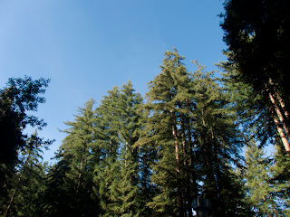
For the redwoods image, the format with the smallest file size was the low quality JPEG at only 43 KB. The greatest file size was the PNG-24, at 861 KB. The highest quality image, in terms of compression and color appeared to be the high quality jpeg. While the PNG may not have had as many compression issues, there were issues with the gradient in the sky. Due to the high quality jpegs image quality and low file size, 147 KB, I would say it is the best option for this image.
gif 64 no dither
gif 64 dithered
gif 128 no dither
gif 128 dithered
gif restricted
jpeg high quality
jpeg low quality
jpeg low quality
jpeg medium quality
png 8-128
png 24
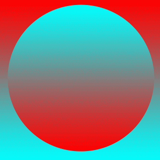
For the gradient image, the format with the smallest file size was, again, the low quality JPEG at only 4 KB. The greatest file size was again the PNG-24, at 53 KB. The highest quality image this time was the PNG-24, with no issues in terms of color, compression or gradient. While the jpegs were smaller files, they showed many compression artifacts around the border of the circle. However, the high quality jpeg's compression artifacts are hardly noticeable at a small scale. Overall though, I would say that for a picture this simple, the PNG was the best choice.
gif 64, no dither
gif 64, dithered
gif 128, no dither
gif 128, dithered
gif restricted
jpeg high quality
jpeg low quality
joeg medium quality
png-8 128
png-24
For the redwoods image, the format with the smallest file size was the low quality JPEG at only 43 KB. The greatest file size was the PNG-24, at 861 KB. The highest quality image, in terms of compression and color appeared to be the high quality jpeg. While the PNG may not have had as many compression issues, there were issues with the gradient in the sky. Due to the high quality jpegs image quality and low file size, 147 KB, I would say it is the best option for this image.
gif 32 no dither
gif 32, ditheredgif 64 no dither
gif 64 dithered
gif 128 no dither
gif 128 dithered
gif restricted
jpeg high quality
jpeg low quality
jpeg low quality
jpeg medium quality
png 8-128
For the gradient image, the format with the smallest file size was, again, the low quality JPEG at only 4 KB. The greatest file size was again the PNG-24, at 53 KB. The highest quality image this time was the PNG-24, with no issues in terms of color, compression or gradient. While the jpegs were smaller files, they showed many compression artifacts around the border of the circle. However, the high quality jpeg's compression artifacts are hardly noticeable at a small scale. Overall though, I would say that for a picture this simple, the PNG was the best choice.
gif 32, no dither
gif 32, ditheredgif 64, no dither
gif 64, dithered
gif 128, no dither
gif 128, dithered
gif restricted
jpeg high quality
jpeg low quality
joeg medium quality
png-8 128
png-24
Subscribe to:
Comments (Atom)


